How to achieve Accessible Design for Digital Products
Digital products, ranging from websites, to apps, and digital service kiosks, should be for everyone. After all, the power of digital lies in its ability to cater to everyone’s individual needs through the adaptable nature of its core information.
The aim of accessible design is to make digital products useable for everyone, regardless of their individual abilities and impairments. This encompasses catering not only to permanent physical or cognitive disabilities but also to a wide range of circumstances and preferences that users may have at some points in their lives.
What does accessible design mean? Fundamentally, an accessible product allows people to perceive, navigate, and interact with it seamlessly and as effortless as possible. Accessible design is about creating products that accommodate diverse needs and preferences, making digital experiences inclusive and welcoming for all.
Why Accessible Design makes sense
Accessible design isn’t just a nice-to-have; it’s a legal requirement in most national and supranational jurisdictions. Laws like the European Accessibility Act mandate that digital products must be accessible to all users.
Beyond legal obligations, there are compelling reasons why accessibility should be a priority in digital design:
- Broader Reach: Accessible websites and apps are not only easier to use for people with disabilities but also for search engines to index. This means that they’re more discoverable for everyone, potentially expanding your audience.
- Aging Population: As populations age, the need for accessible design becomes even more important. Catering to individuals who may experience diminishing eyesight, hearing, or mobility ensures that your products remain relevant and usable.
- Competitive Advantage: Investing in accessible design gives your business a competitive edge. By catering to a diverse audience, you’re positioning yourself as inclusive and responsive to user needs, which can enhance brand reputation and customer loyalty.
- Legal Compliance: Many international laws mandate accessibility standards for digital products. Compliance not only mitigates legal risks but also demonstrates a commitment to social responsibility and inclusivity.
- Inclusion: Ultimately, accessible design is about creating a sense of belonging for all users. Everyone deserves to feel welcome and included in the digital space, regardless of their abilities or limitations.
Contrary to common misconceptions, implementing accessibility features doesn’t necessarily compromise visual aesthetics. A majority of accessibility enhancements can be done “beneath” the surface of the visual interface, by optimizing the semantic structure of the source code and adding crucial attributes and parameters.
Understanding User Types and Assistive Technologies
When designing for accessibility, it’s crucial to consider various user types and the assistive technologies they rely on:
- Screenreader Users: People with visual impairments rely on screen readers to navigate digital content. Design considerations include providing text alternatives for all content, ensuring keyboard operability, and offering immediate feedback for actions.
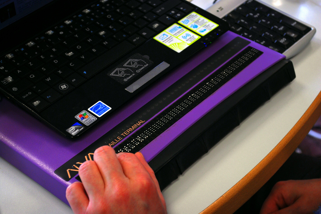
- Refreshable Braille Display Users: Deafblind individuals often rely on the use of refreshable braille displays that provide a tactile way to interact with a digital product. Simplifying design elements and providing text-based alternatives for multimedia content are essential considerations.
- Screen Zoom Users: Individuals with low vision use screen magnifiers to enlarge content. Designing with sufficient contrast, clear hover/focus states, and fully resizable interfaces caters to their needs.
- Captions/Transcripts Users: Deaf or hard-of-hearing individuals rely on captions and transcripts for multimedia content. Including captions for videos and transcripts for audio ensures accessibility for this user group.
- Keyboard Users: People with motor impairments may rely solely on keyboards for navigation. Thus, full keyboard operability enhances accessibility for these users.
- Voice Control Users: Users with mobility impairments may rely on voice control. While voice control can enhance accessibility, it’s essential not to depend solely on this feature, considering potential limitations such as stuttering.
In order to achieve Accessible Design, a variety of measures need to be considered and implemented. The actual measures vary from case to case, since they greatly depend on factors like the relevant audiences and their specific needs and abilities, as well as the product and touchpoints/platforms being used. While consequently there is not one single guideline, I’ve tried to list the most important overall things to consider.
Size and Legibility
One of the core topics when it comes to usable and legible information involves the size of texts and interactive elements.
Sufficient Text Size for Legibility
The ideal text size for optimal legibility depends on various factors such as the average visual acuity of the relevant target groups: Are mostly young or rather old people going to use it, or even people with impaired vision? The DIN-1450 standard contains recommendations for text size, based on “normal” visual acuity, specified with a minimum of 70% – The visual acuity prevalent in the majority of the population.
Together with other factors such as typical lighting conditions, viewing distance and the characteristics of the chosen typeface (ratio of font’s x-height to font size), the minimum text sizes for optimal readability can be calculated. I can highly recommend the font size calculator by the German Federation of the Blind and Partially Sighted for such task.
However, for most web-based projects, you don’t need to do all this hard work, since basic rules of thumb have been agreed on. I’d only recommend taking the extra mile when you’re dealing with very special project setups and audiences or uncommon devices, such as we did when redesigning the cash machine user interfaces for a bank.
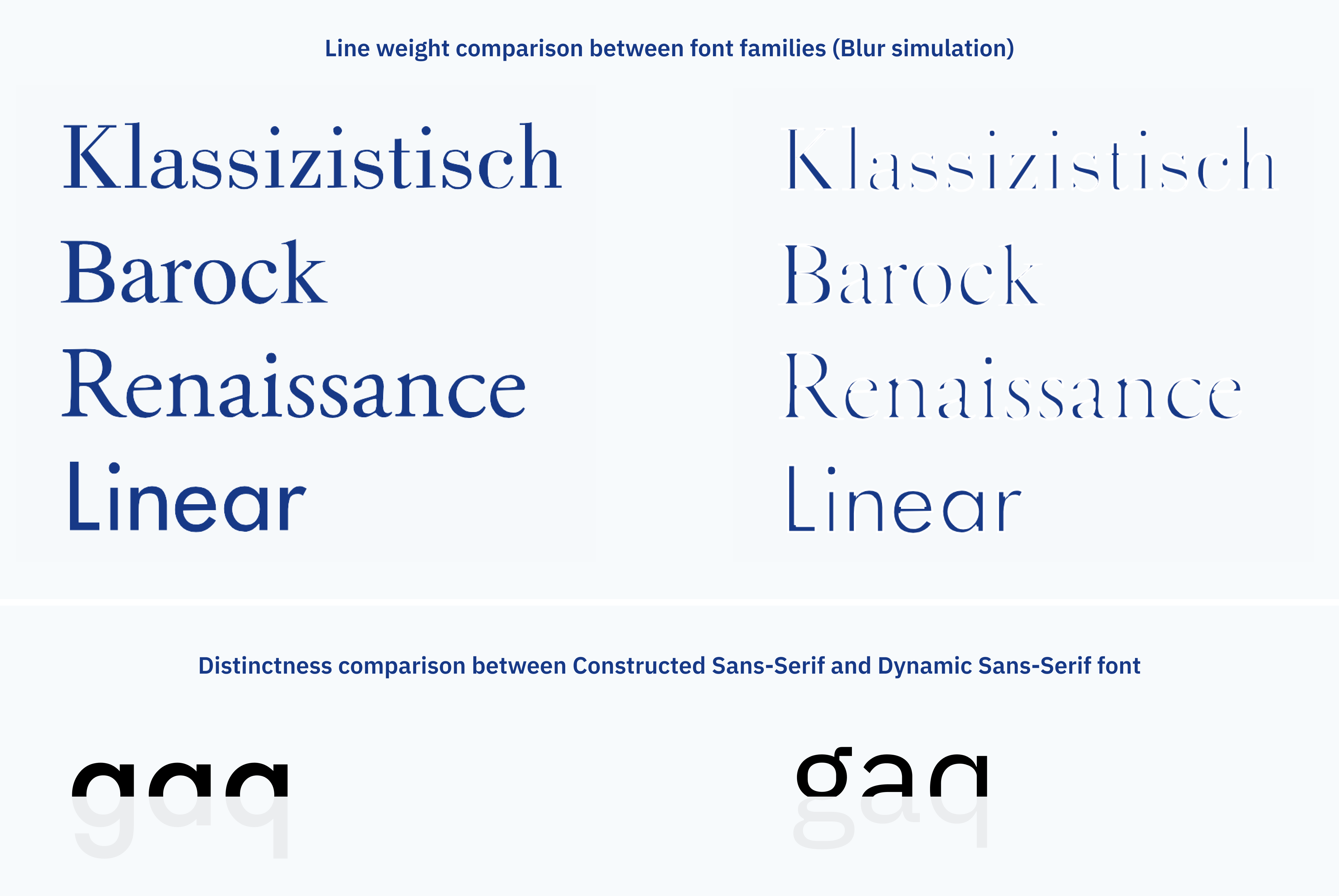
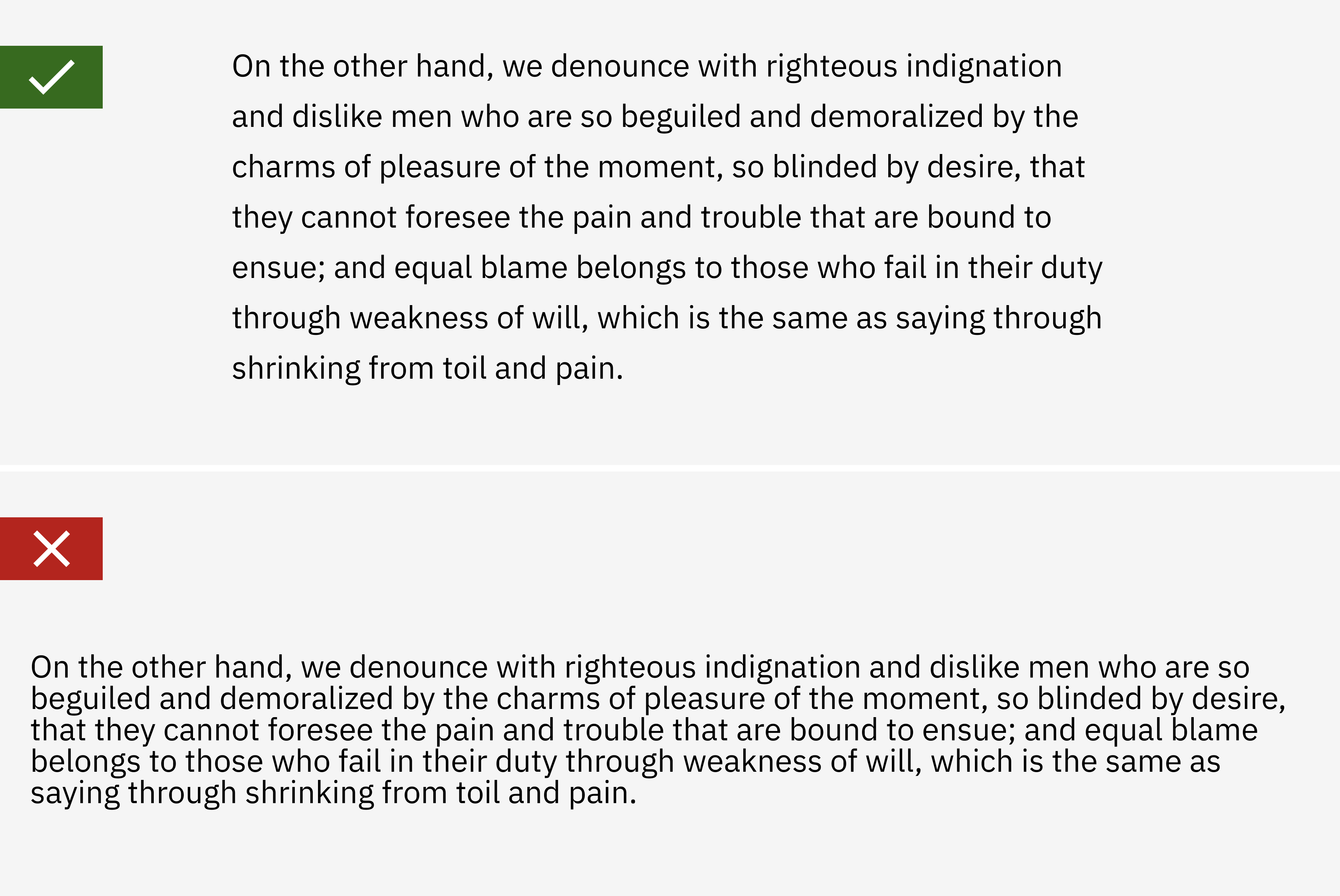
For standard website cases, a minimum font size of 16px for body text is a common recommendation. Bigger is always better in most cases to guarantee optimal legibility without the need to adjust broswer settings. Equally important for good readability are factors like line-height (which should at least be 1,5 times the font size) and choosing the right font type for the amount of text and the medium.
Generally speaking, dynamic Sans Serif Fonts with open characters are more legible than Serif fonts or geometric Sans Serif fonts.
Resizability of text
Even more important than choosing the right minimum font size in the design, is to give users the ability to resize text to one’s own preference, using the operating system’s or browser’s settings. As long as proper text is used in the website markup, this should be the case.
You should test your layout to enable text resizing of up to 200% without becoming unreadable oder unusable – that’s the success criterion defined by the WCAG.
Size of actionable User Interface Elements: Links, Touch/Click targets
Besides the size of text, the size of user interface elements that trigger actions is crucial.
Buttons, menu items, form fields and other interactive elements need to be large enough to be easily tapped or clicked, especially on touch devices. The W3C Web Accessiblity Initiative defines a minimum target size of 44×44 CSS pixels as a recommended target size, and so does Apple in their guidelines. Google goes for a recommendation of 48×48 density independent pixels for touch targets.
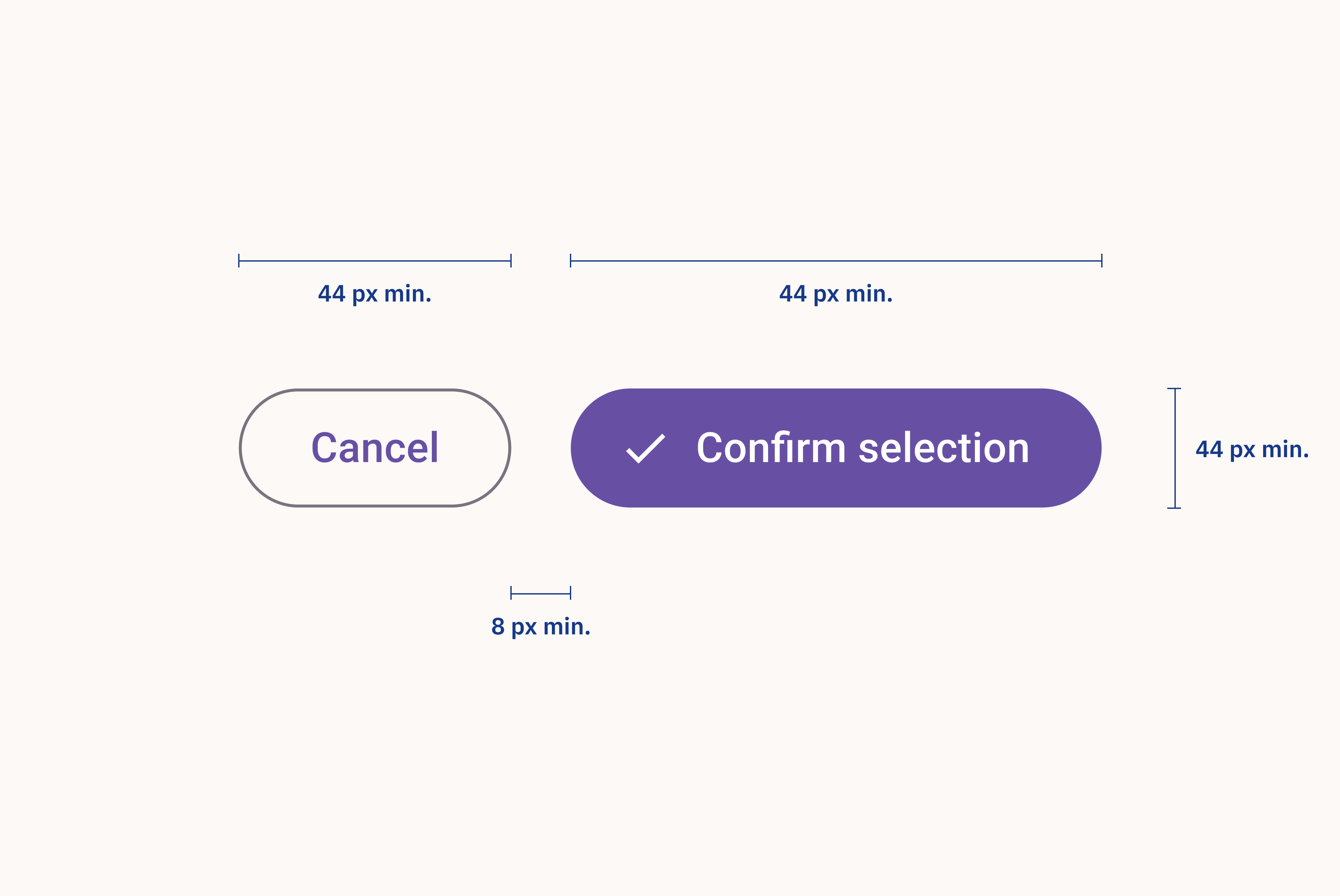
Of course, the underlying invisible touch/click target may be bigger than the visual representation of the element to achieve a lightweight visual experience.
To prevent accidental clicks or taps, a minimum gutter of 8 density independent pixels should be left between targets.
Visual Hierarchy
Establishing a clear visual hierarchy through text sizes, and spacing helps users navigate and understand the content.
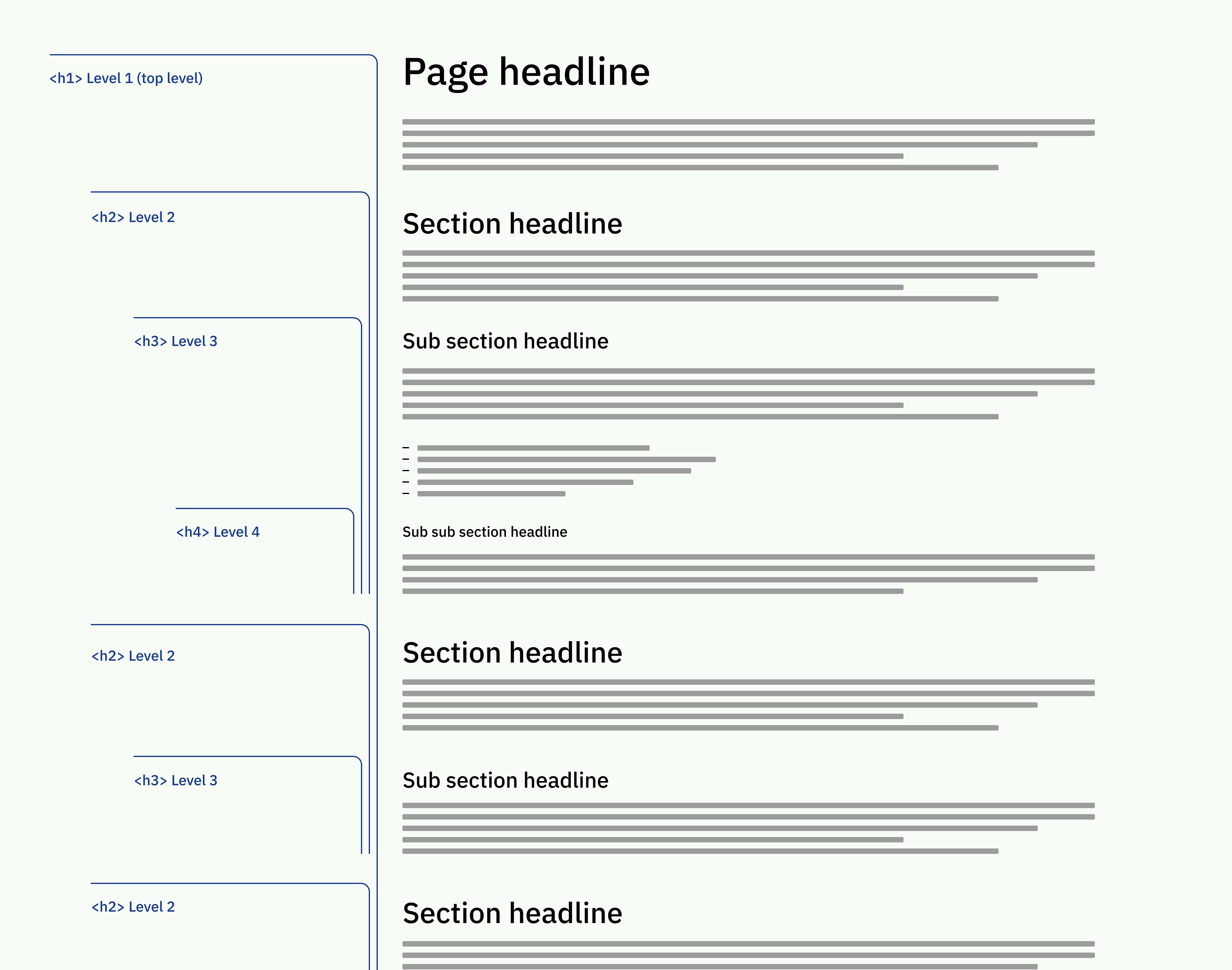
Headings should be used to structure content, with larger sizes indicating higher importance. As a rule of thumb, each web page should only use one H1 heading. It is the page’s most important headline and needs to communicate the page’s overall topic or goal. Therefore, it should use the largest font size.
Beyond the H1, other headings should be used, to properly cluster the information and make the text more scannable. A clear hierarchy from H1 to H6 should be used to enrich the text with semantic information. Within each section of the content, heading levels should be used consecutively.
Color and Contrast
Color and contrast are vital considerations to ensure content is perceivable by all users.
Sufficient Contrast for meaningful information
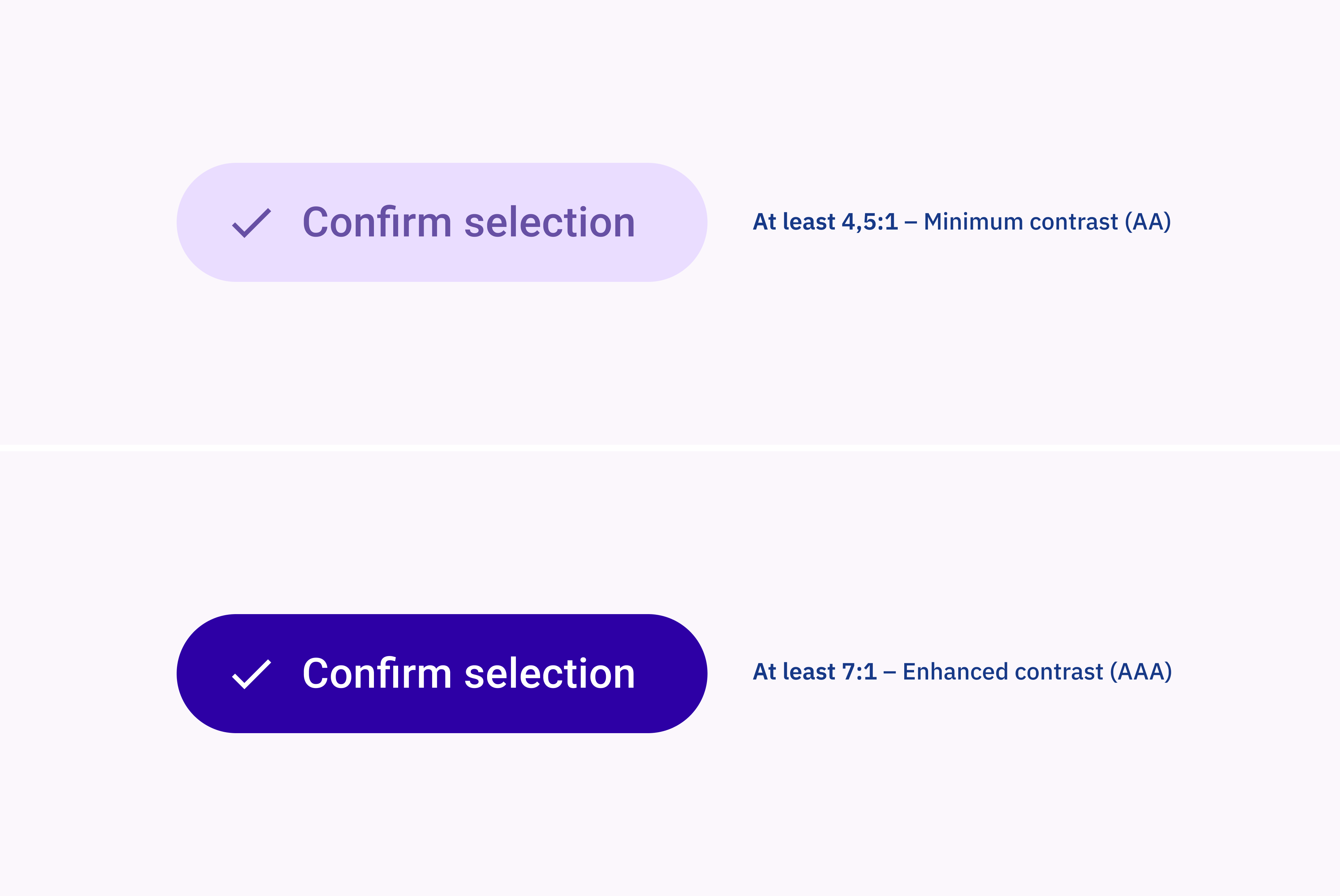
Text and interactive elements need to have sufficient contrast with their background to ensure readability and perceivability. The WCAG outlines specific contrast ratios for achieving sufficient readability and recognizability across various levels.
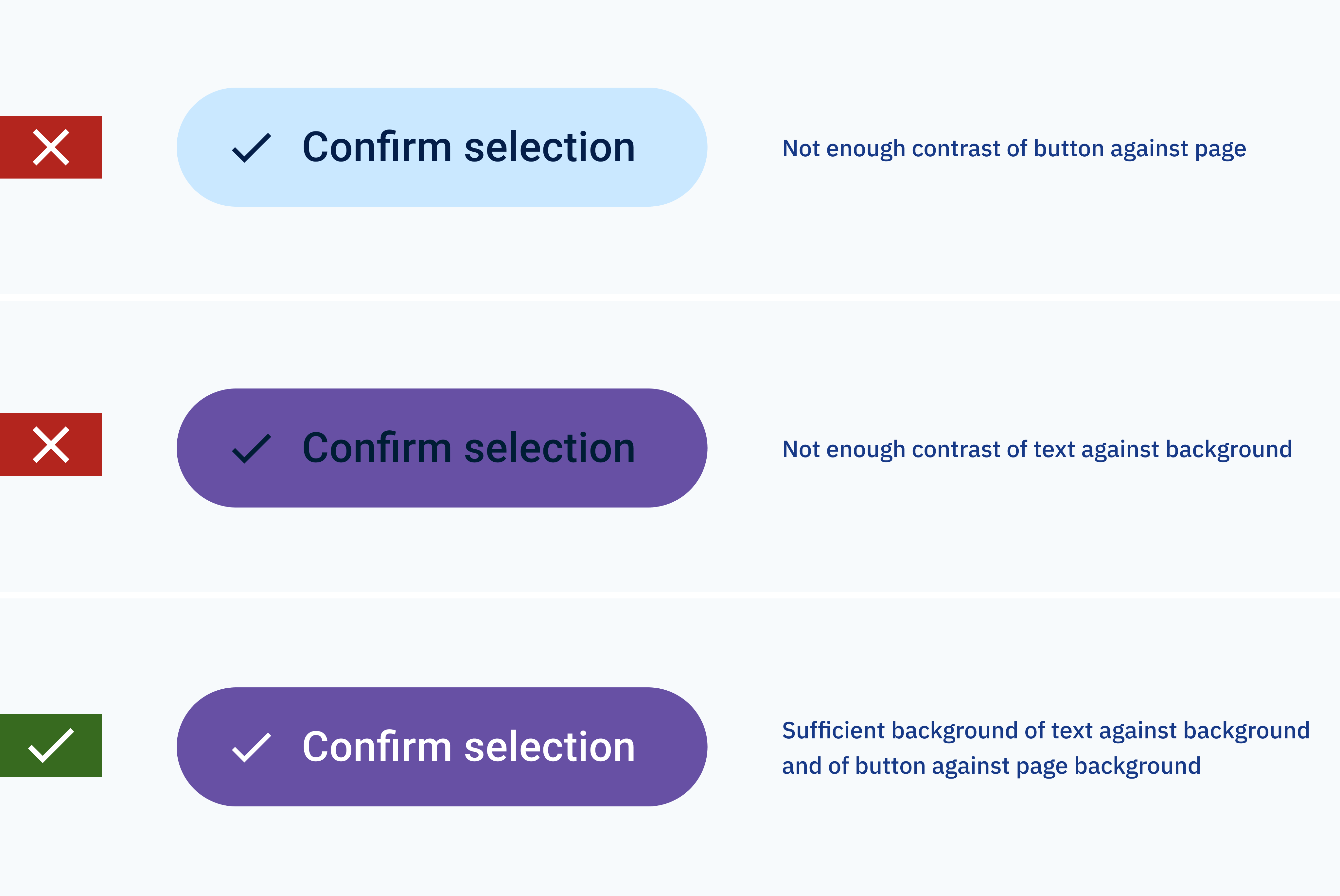
For Level A compliance, the minimum required contrast ratio for normal text is 4.5:1, while for large text (at least 18pt or 14pt bold) and UI components, it’s 3:1.
Meeting Level AA compliance entails a higher standard, with normal text requiring a contrast ratio of 7:1 and large text needing 4.5:1.
Level AAA, the most stringent, demands even greater contrast, with normal text requiring 7:1 and large text 4.5:1. Adhering to these ratios not only ensures compliance with accessibility standards but also enhances the usability and inclusivity of digital content for all users.
Multisensory Information
Avoid relying solely on color or visual cues to convey information. People who cannot distinguish between certain colors would miss the information conveyed by color.
Meaningful visual elements like icons need to be accompanied by descriptive text. This is to ensure that information is accessible to all users, including those with color blindness or visual impairments.
Structural Considerations
A well-structured layout and clear navigation enhance usability and accessibility.
Page Title
Each page should have a descriptive title that accurately reflects its content or purpose. This helps users understand the context of the page, especially when navigating with assistive technologies like screen readers.
Besides, a concise and meaningful page title summarizing the page’s topic has great impact on search engine performance.
Keyboard Accessibility
Being able to interact with a digital product not only through mouse or touch input is critical for achieving accessibility.
Ensure that all interactive elements such as buttons, menu items and links are accessible via keyboard navigation, providing alternatives to touch or mouse input. This ensures compatibility with various assistive technologies and accommodates users with motor impairments.
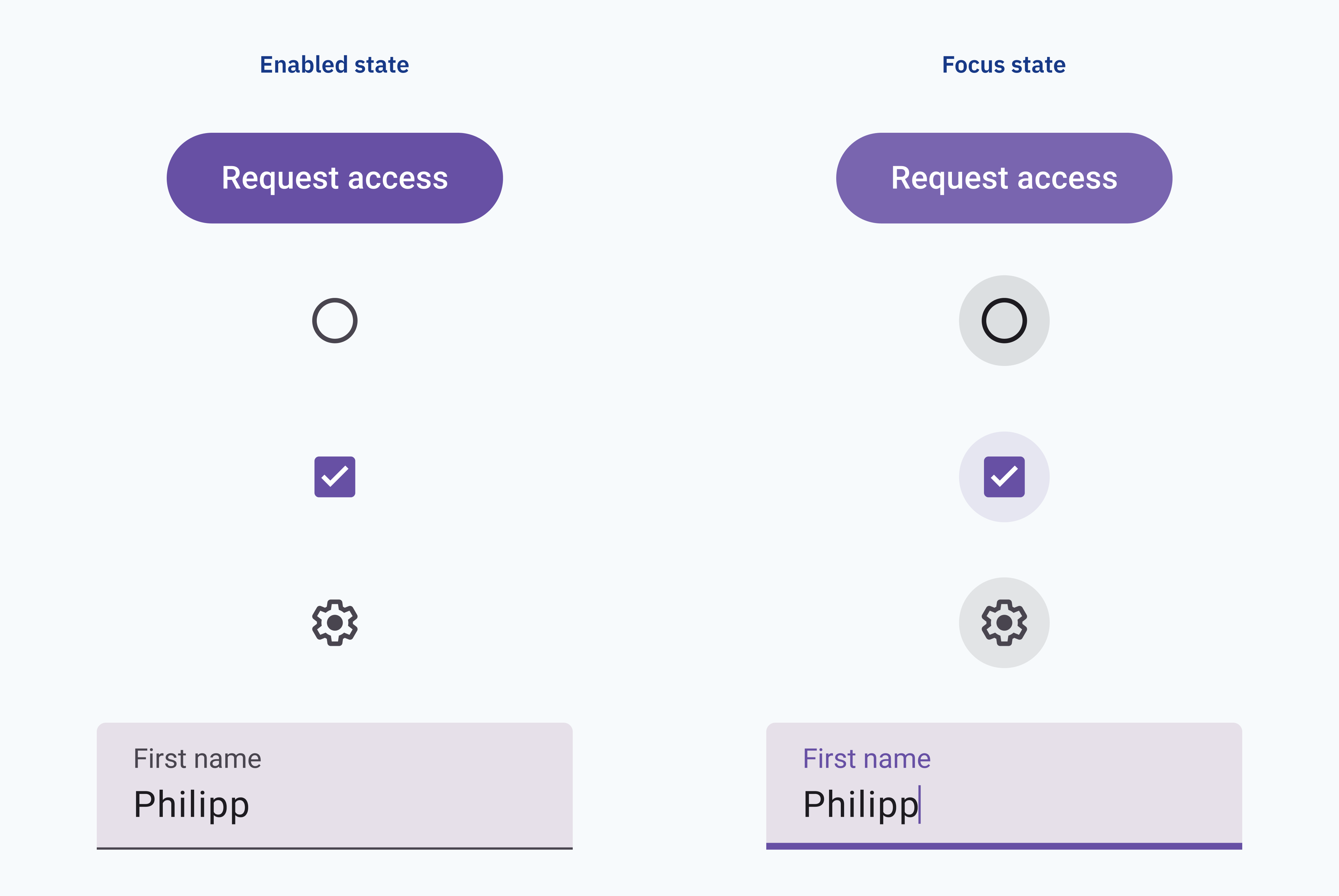
Additionally, proper tab order ensures logical navigation for keyboard users. To support orientation when navigating a page via keyboard input, focus states for all interactive user interface elements are essential. Browsers apply a default style for focus states but implementing your own matching focus styles is recommended.
Skip Links
Skip links at the beginning of the page allow users to bypass repetitive navigation and jump directly to the main content. This feature is particularly useful for screen reader users who may otherwise have to navigate through multiple menus and links.
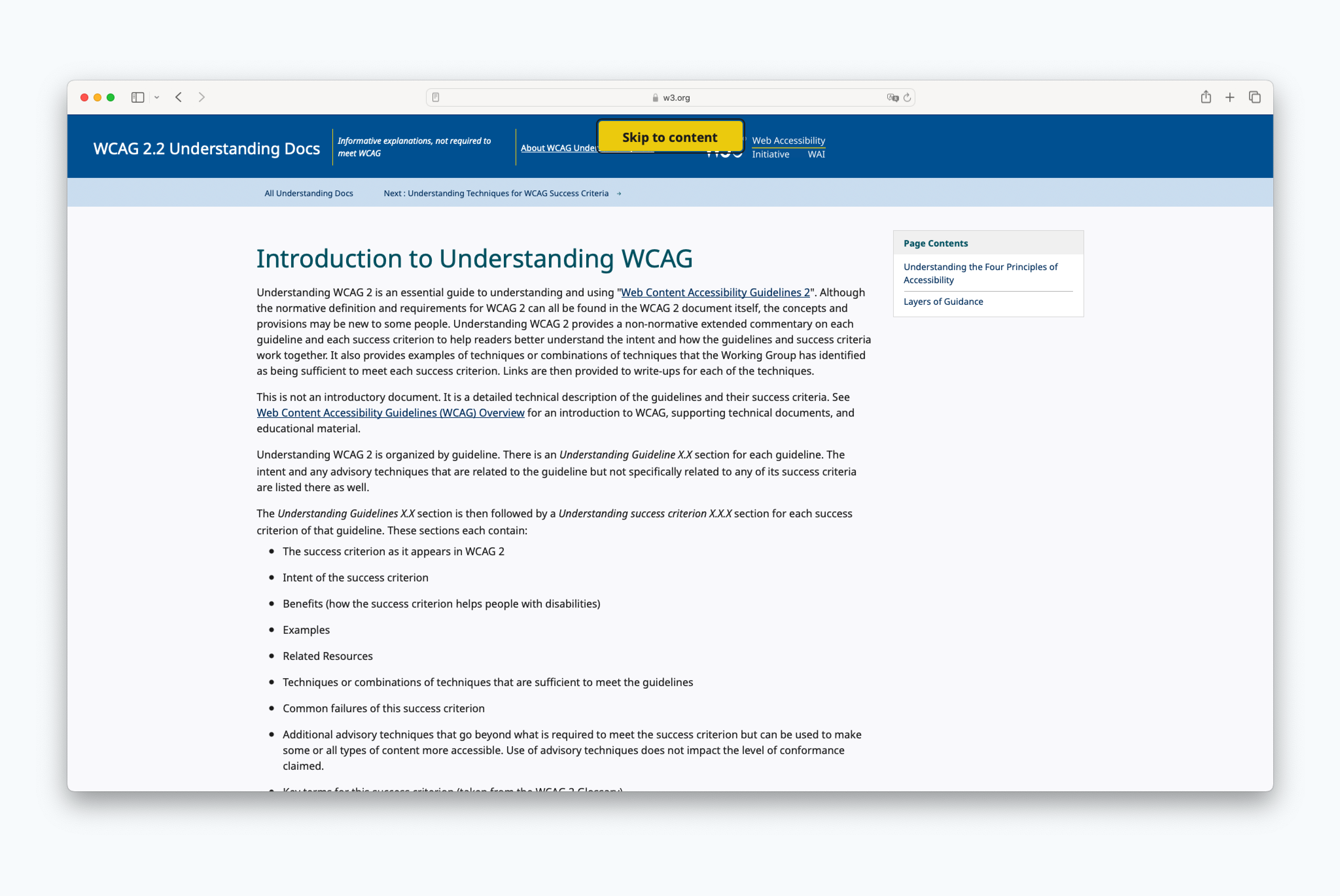
The proper use of HTML/ARIA landmarks (header, nav, main, footer) enhaces the structure of the site semantically. It points screen readers directly to the right place of the content.
Avoiding disabled elements and focus traps
Disabled form fields or buttons can cause usability problems, but are particularly problematic in the context of Accessibility. They are not focusable by default for people using the keyboard or other assistive technologies to navigate through a form. Therefore, users may easily miss that the element even exists. Imagine a badly designed form with a disabled button as the only hint, that some inputs are missing or invalid. Users of assistive technologies will not know that something is wrong – and fail to proceed.
Try to avoid disabled elements altogether.
Layers on top of the user interface such as popup or modal windows often break the keyboard tab order or are not accessible by keyboard at all. This also holds true for a lot of third party add-ons like cookie notification banners. That’s why the implementation of such patterns should be treated with special care if they cannot be avoided.
Forms with Sections and proper Labels
Accessible forms can be navigated using the keyboard only, in adition to using a mouse or touch interface. Also, as stated earlier, each form field needs clear focus states in order to give orientation for keyboard users.
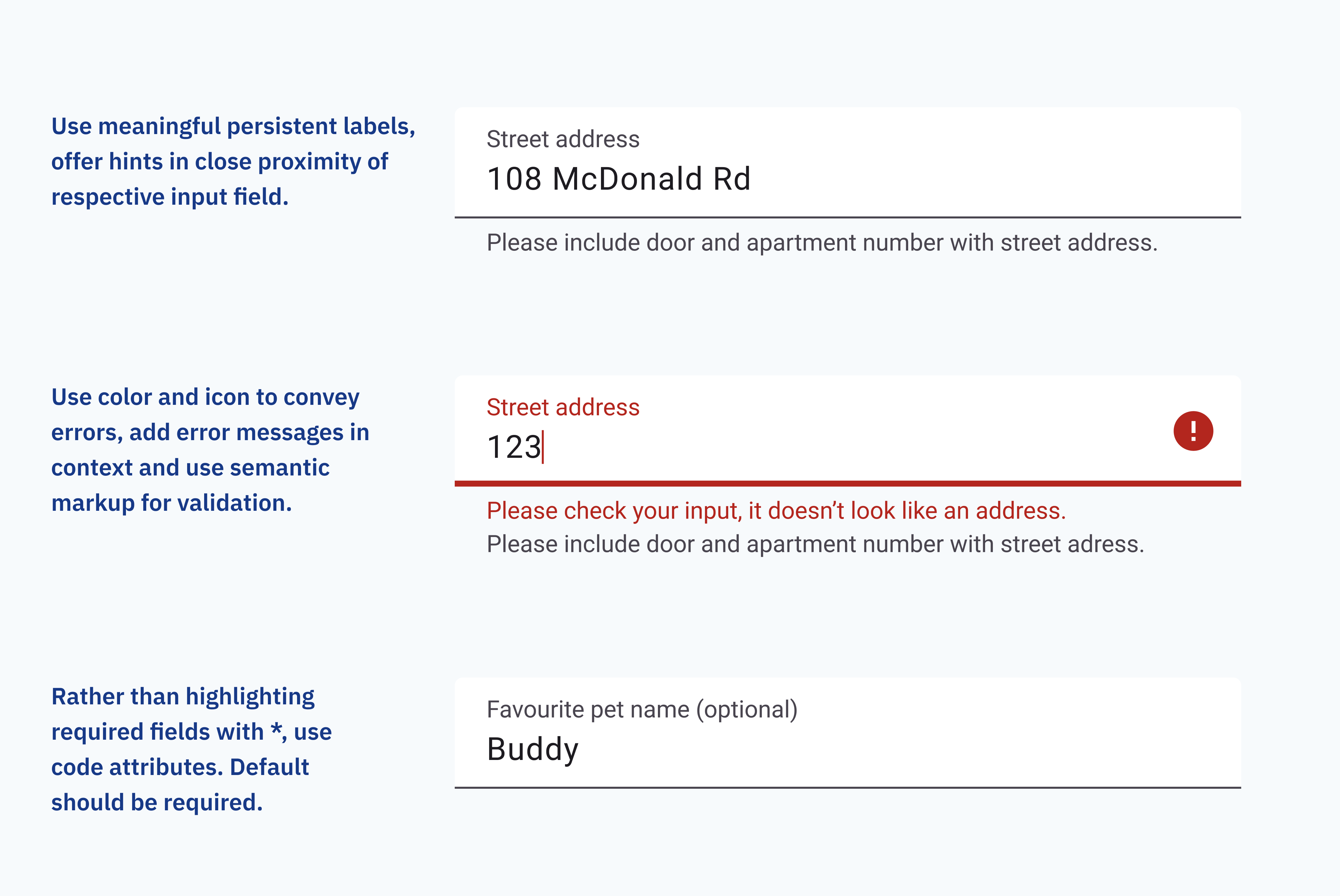
Form fields should be accompanied by clear and descriptive labels to indicate their purpose or expected input. Proper and always visible labeling helps all users understand the form and complete it accurately. It is important to include any necessary context and information for the respective field adjacent to it. This way, users of assistive technologies get all of the information they need at the time.
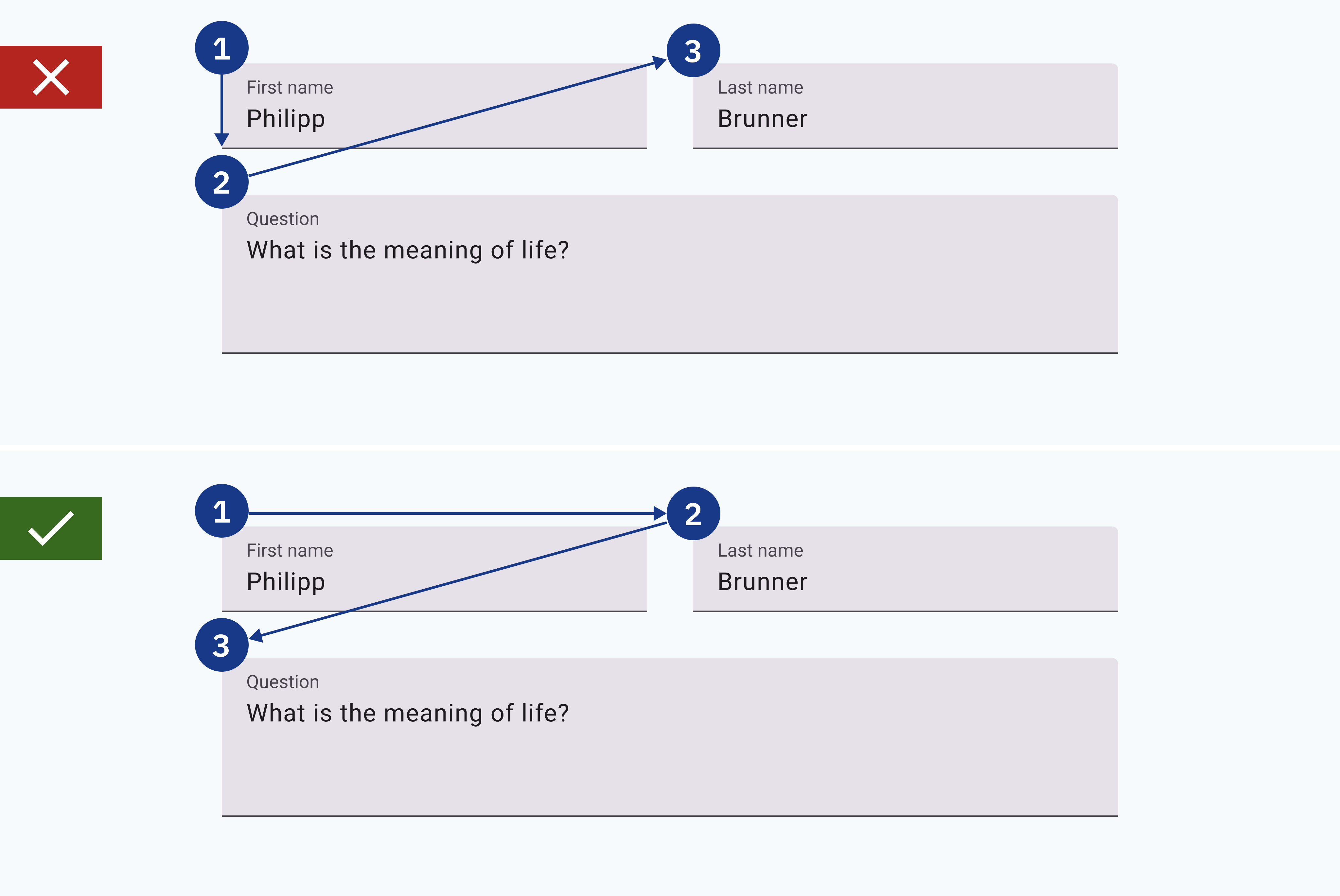
Forms should be clearly organized using <fieldset> and <legend> on the frontend code side. All controls should be placed in close proximity to the form elements they are controlling. Just think of “Edit” or “Delete” buttons, that only make sense next to the elements they’re supposed to impact.
Required form fields are often marked by an asterisk in conventional form design. A practice that doesn’t make much sense for screen reader users. An ideal approach would be a form that only consists of necessary required fields and has no optional fields. Also, required fields should be appropriately marked in the frontend code, using the aria-required attribute. A similar attribute could be used to hide field hints like an asterisk from screen readers.
Accessible validation of forms is another complex topic. It requires a lot of measures on the code side using ARIA attributes – enough for an entirely separate blog post. In the interface, accessible forms require clear error messages and sufficient information for users to correct their errors.
Tables
When using data tables, provide appropriate captions and ensure that columns and rows are properly identified in the markup.
For complex tables, consider simplifying the presentation or providing additional explanations to aid comprehension. A summary of the table’s meaning enhances usability for people using a screenreader.
Zoom and Orientation
Design interfaces that allow users to magnify or zoom in on content without loss of functionality or layout. Additionally, ensure that websites are usable in both portrait and landscape orientations to accommodate users’ preferences and device capabilities.
Text to Convey Meaning
Textual content should be structured and descriptive to convey meaning effectively for all users – and assistive technologies.
Accessible Language
The primary goal of communication is to convey information. Thus, the concept of plain language is all about concise information, devoid of unnecessary jargon or complex terms.
Use plain, accessible language with proper headings, short sections, and lists to facilitate comprehension for all users. Especially those with cognitive disabilities or language barriers will greatly benefit from plain language.
Alternative Texts for Images
Providing descriptive alternative text for images is essential for users who rely on screen readers. Alt text should convey the purpose or content of the image, distinguishing between essential content and decorative elements. Images should include descriptive alt text that conveys their purpose or content to users who cannot see them. They should be concise yet informative, providing essential context for the image. Also, Alt text impacts SEO and can help to increase your website’s visibility.
If removing an image from a page would decrease its information value for users, then the image is informative and needs an alt text.
More useful tips on writing alt texts can be found at this Image Alt text best practices page.
The right alt text depends on the context the image is used in. Complex images like charts or very detailed and relevant illustrations need specific descriptions. In this case, the alt text should give an overview and refer to a more detailled description below the graph/image.
Images that don’t add information value or are included only for decorative purposes don’t need alt texts. In this case, the alt-Tag should be left empty.
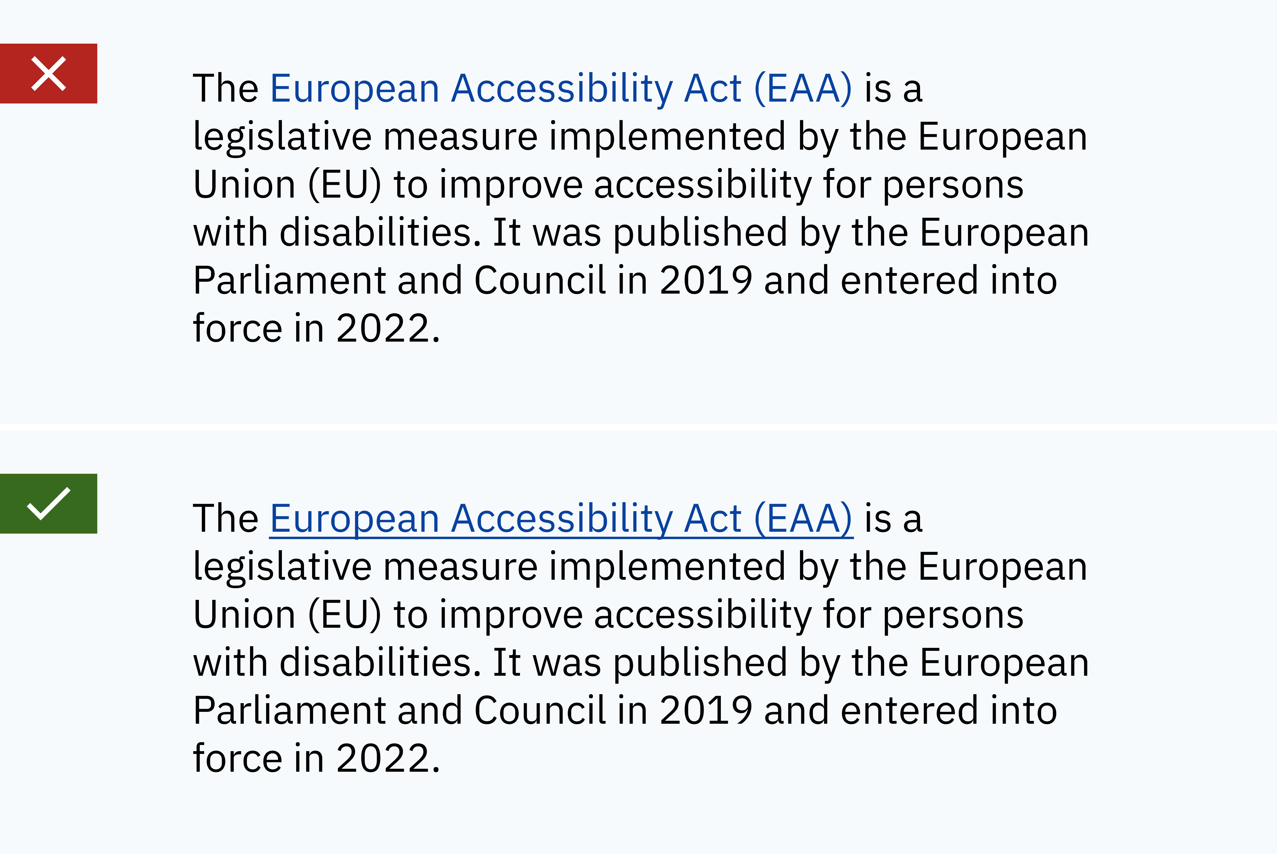
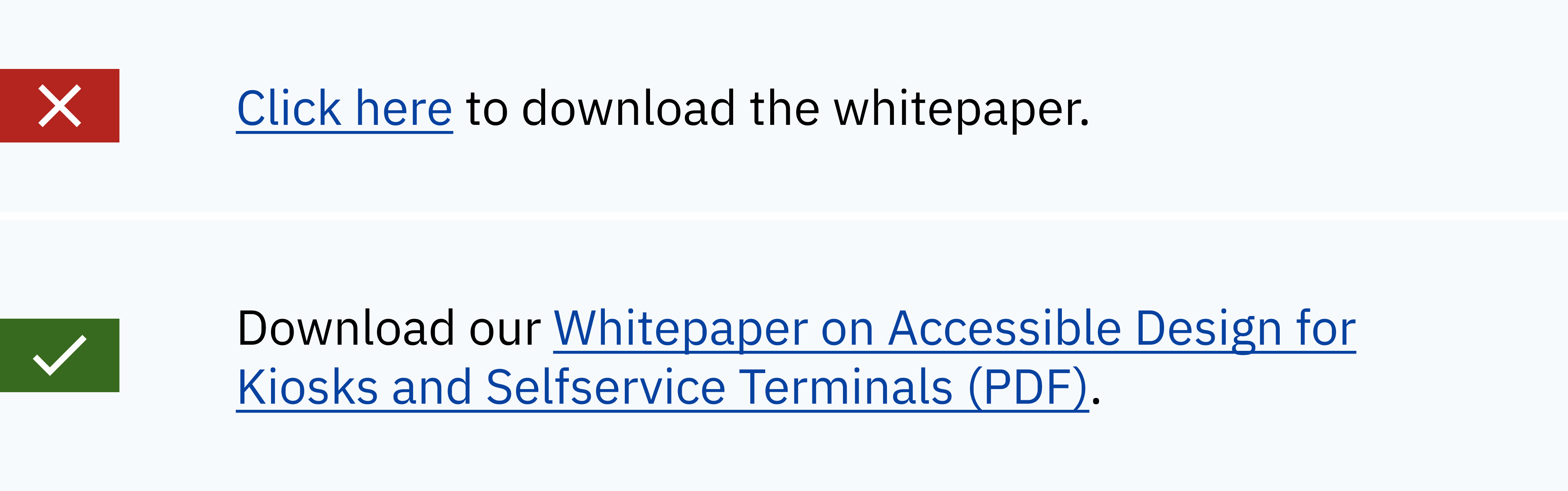
Accessible Links
Links should have meaningful and descriptive anchor text that conveys their purpose or destination. Do not use vague or ambiguous link text like “click here” or “more”. Those generic labels can be confusing for users, especially when taken out of context. Short generic link texts for article previews can still be used, as long as they contain a meaningful link text in the code.
Accessible link texts should make sense without any additional information. Just ask yourself: Will it reveal the purpose or destination of the link?
Considerations for Time-based Content and Animation
Animated content can add variety and uniqueness to a digital service. However, certain precautions should be taken to guarantee Accessible Design.
Animation Accessibility
Avoid using high-frequency animations or animated images with “flashes” more than 3 times per second. Those high-frequency animations may cause distractions or discomfort for some users. Provide options to pause or control animations to accommodate individual preferences and needs. That’s especially required for video content that is longer than 5 seconds.
Additionally, audio and video content should never use autoplay. This is annoying for everyone, but especially for people who cannot directly access controls to stop it.
Captions and Subtitles
Videos should include synchronized captions to make the content accessible to users who are deaf or hard of hearing. Additionally, audio descriptions may be necessary to convey important visual information to users who cannot see the video.
Subtitles are translations of a video’s audio content for people who don’t speak the language of the medium. Another matter of accessibility, if parts of your audience speak different languages.
Audio content requires a transcript to be accessible to people with impaired hearing.
Enough Time
Users with disabilities may need more time to complete tasks than the majority of users. Thus, enough time needs to be provided for these users to react to things like session timeouts, re-authentication or other timed events. Provide a calm environment for reading and interaction through offering adjustability for time limits. Or even better: remove the need for timed interaction entirely.
Accessible Design shouldn’t be an afterthought
Accessible Design is a complex topic. Each of the measures summarized on this page requires articles on their own to discuss them in detail.
That’s why Accessible Design should be considered from the start of a project. It needs to be pursued through every stage of the digital design process by the whole team. Accessible Design requires building knowledge, experience and empathy in digital design teams, to start with.
Eventually, any digital product or service will benefit greatly from Accessible Design.