Date of birth selection – a small interaction design case study
These days in 2021, the Covid19 pandemic still persists. At least, here in Vienna, we have a decent infrastructure for self-conducted PCR-tests, including submission and results retrieval via a web app.
Although I’m already vaccinated, me and my family continue to test regularly, using the web application. As a nice side effect, I get to examine product design and design iterations of the platform from the front row.
Until recently, the date of birth selection for accessing my test results in a two-factor process was a real pain. Unsurprisingly, a lot of other users obviously felt this way too, and the company changed the date of birth selection for the better.
In this post, I have summarized my experiences with two different methods of entering my date of birth.
Fully digitized Covid19 PCR test
The Viennese company Lead Horizon by Dr. Christoph Steininger and Michael Putz set up an effective Covid19 self-testing service in cooperation with the Lifebrain laboratory. This service offers very easy and convenient kits to perform PCR gargle tests at home, supported by a web app. The gargle sample can be submitted for analysis at various branches of supermarket and drugstore chains in Vienna. If submitted until 9am, the result will be delivered by the evening of the same day. Results can be reviewed online, using another web application.
The process is pretty straightforward and a matter of minutes. We have gotten used to receiving our test results some time late in the evening, ready for the next day.
When the results are ready, a notification will be sent via e-mail. To access the results, a login using two-factor authentication must be completed. Users need to enter their date of birth as the first factor. Then, a text message containing a login code will be sent to the user’s mobile number.
This way, no password needs to remembered. A nice, user friendly way to log in.
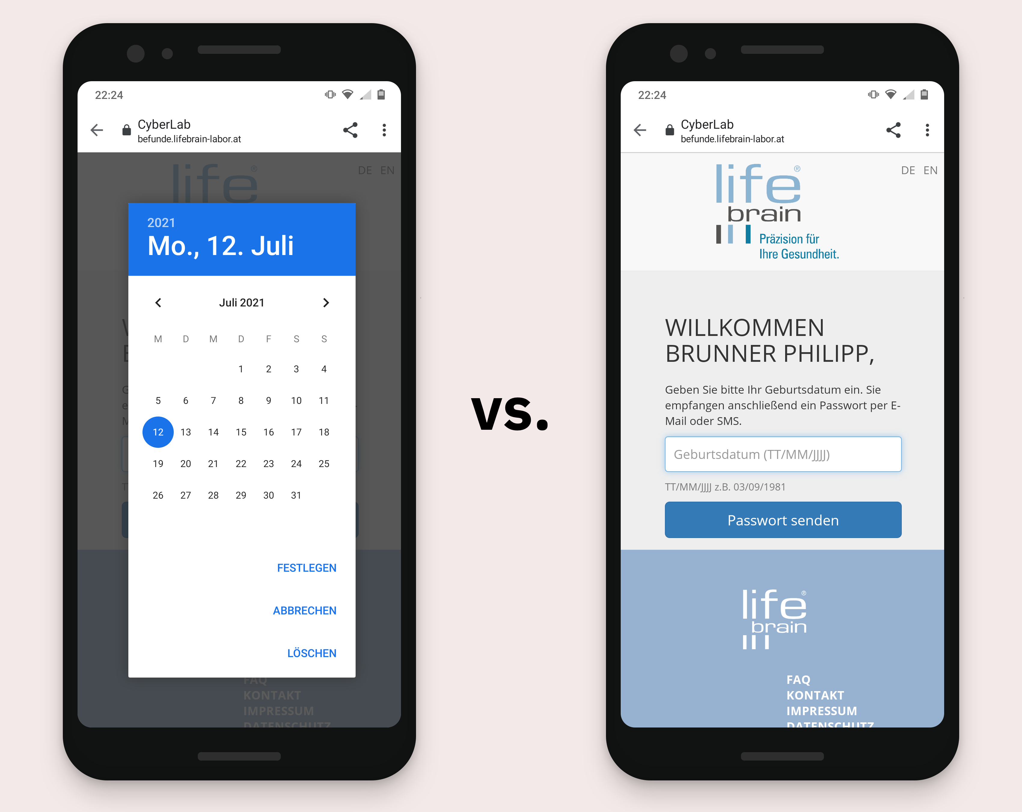
Selecting date-of-birth using a native date picker component vs. entering the date into an input form field.
If only selecting date of birth was easy to complete. But with the first iteration of the product, it was not. Actually, it was a real pain.
Date of birth selection using a native date picker
I‘m pretty sure, the design and development teams had to deal with a lot of complexity in little time and felt the pressure to release the product as quickly as possible.
These factors might have considerably influenced the decision to use native date picker components for selecting the date of birth.
Some advantages from a development perspective:
- The component is provided by mobile operating systems like Android or iOS, by implementing an input element with the type-Attribute “date”
- Therefore, it’s fully compliant with current web standards
- It makes selecting an invalid date impossible, the component would always return a correct date stamp
- It‘s an OS-native component, so one could assume it‘s been learned by users
All valid arguments. But using a date picker to select a date of birth is annoyingly lengthy.
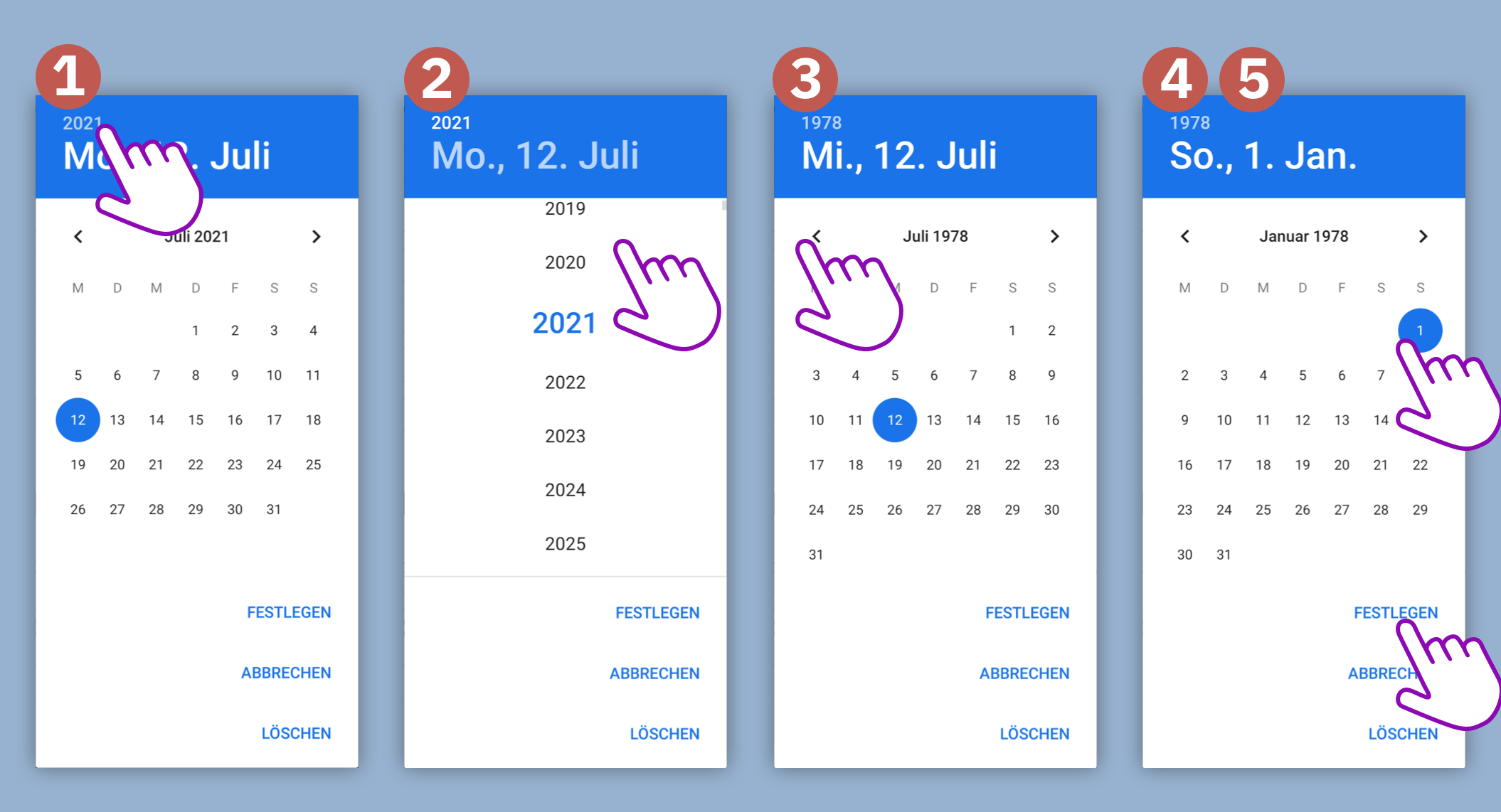
A date picker is perfect for selecting a date relatively close to the current date. It provides an overview of closely past and future dates and it‘s easy to go back and forth a couple of weeks or months. Also, it gives a nice overview of weekdays. Useful features, but completely useless when selecting your date of birth. After all, this is a date we all know by heart and are very quick to type.
Here‘s why the date picker is a bad choice for selecting a date of birth:
- Per default, the date picker shows the current date. Lucky you if you are young of age.
- Changing the year requires tapping the year, at least on Android. That‘s quite a hidden feature considering the design of the picker‘s „title bar“ and the style of the year number. I assume, a lot of users have never done this and would not find this shortcut. Imagine having to go back to your birth year by swiping through months…
- The process is lengthy: On Android, it takes around 4 to 5 steps and many more taps/swipe gestures, depending on your actual date of birth and the current date.
- Context is lost: Ok, this might be a minor problem, but since the date picker component takes up the whole mobile screen and there‘s no room for a label or description, one could even forget what one was even required to do.
It would be so easy, to just type my date of birth into a plain form field…
Date of birth selection using a html input field with some magic
I was pleasantly surprised, when I logged in the other day to retrieve my latest test result: no more date picker!
Instead, a simple input field prompted me to insert my date of birth. It even came with a descriptive placeholder text/label AND an input hint right below the field.
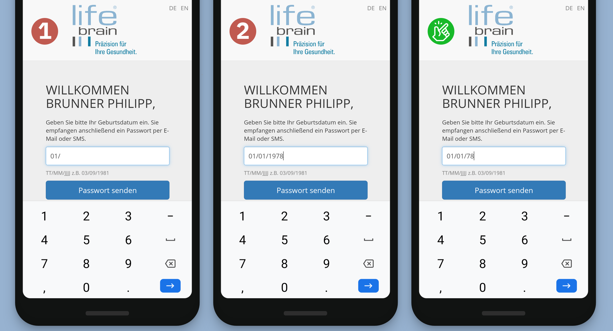
Finally: a plain input field to let me just write down my date of birth, which I know by heart anyway.
The input field‘s degree of freedom comes at a price, when entering a valid, unambiguous date of birth. To make sure that it supports users in entering the date in the right and clear format requires some extra work.
In my opinion, this is extra work keeps a lot of teams using other patterns like date pickers, select menus or others.
Here‘s why I love the input field for entering my date of birth like shown above:
- It‘s super responsive: just tap the field and start typing the date. No popups.
- It maintains context: Until I start typing, I can see the placeholder text hinting the right format to enter. The text above the field tells me what I have to do. The input hint below the box also supports me in entering the date right.
- It’s error-proof: I don‘t have to type dots or slashes. As soon as I‘ve entered two digits for the day or month, a slash will be shown and indicate that I‘m ready to type the next part of the date. But if I do type a slash or a dot (out of habit), no errors occur.
- Only relevant number keys are shown for input
- The input logic is flexible in a cool way: It accepts years in a two-digit format (‚78‘) as well as fully written (‚1978‘)
- It‘s fast: typing this well-known date only takes a few strokes on the (virtual) keyboard and I‘m done
Room for even more improvements?
These simple changes greatly reduce the time needed for login. Nevertheless, there are some small details that might still be suitable for improvement:
- Using slashes between the date values is very uncommon in Austria and Germany. I would recommend displaying dots instead (‚01.01.1978‘)
- Placeholder values as input hints could even be displayed in the input field while entering the date (‚01.MM.YYYY‘) using different typographic styles. This could further support users in entering the required date format and might feel even more responsive
All in all, this small example shows, how good UX is all about the details in interaction design – and how small changes can have a big impact on efficiency and overall experience.
Disclaimer: I‘m in no way affiliated to Lead Horizon or Lifebrain. Just a user, enjoying their product and service!