Designing a country selector with integrated language selection
Switching languages on a multilingual web portal is fairly common. Other sites let visitors select their country to proceed to a localized variant. Read about design challenges combining both patterns.
As a visitor of a multinational web portal, I want to to read the site’s content in my own native language. That’s why it’s fairly common for big websites to offer different language versions of the site. Depending on the global network and website architecture, sometimes web users are even redirected to national versions of the site based on their selection.
In a project for one of our global clients we had to solve unusual requirements:
- Integrate a country selector for multiple national versions of the site (about 15 countries)
- Include a language selector for countries with more than one language
- Use a predefined section in the website header for the country selector
- Out of scope for this project (due to technical constraints): Autodetecting region and language
I started with some upfront best practice analysis and research. There’s a lot of information available on these topics – yet we needed a custom solution to meet the very specific requirements.
The problem with labelling language links
Online, there are no borders and nations. The „natural“ target market for any digital product with a general value proposition is global. That‘s why successful online products and websites need to deal with audiences from all over the world. Native language however, still is the key to seamless product experiences. Users should be able to use a product in their own language.
Enter language selectors. Found on a lot of websites, they consist of a simple dropdown or switch most of the time. What‘s crucial for offering an effective language selector?
- Make sure that it can be recognized by someone speaking a different language than the current selection
- Available language options should be labeled in native language to enable users to find their language quickly
Despite a multitude of language selectors on the web, most don‘t fulfill these crucial criteria. Often, general English language labels are used to label available languages. For someone not speaking English at all, this poses an insurmountable obstacle in finding the right language version. Also, this makes language selectors hard to find on a website – especially if not accompanied by a good icon.
Some websites try to make up for not using native language labels by adding flag icons to the correspondent language labels. While this helps most people to find the language selector, it‘s still not a proper solution:
Flags symbolize nations, not languages. Just think of languages that are spoken in more than one country, for instance English, French or Spanish (just to name a view).
Flags are appropriate for symbolizing nations only
Flags are perfectly fine for supporting country selectors. Since everyone knows their country’s flag by heart, seeing a flag icon accompanying a country label can make country selection much easier and quicker.
That’s because we tend to visually scan web pages instead of reading every word on it. A colorful icon quickly catches one’s attention – even more so if it’s one’s own country’s flag.
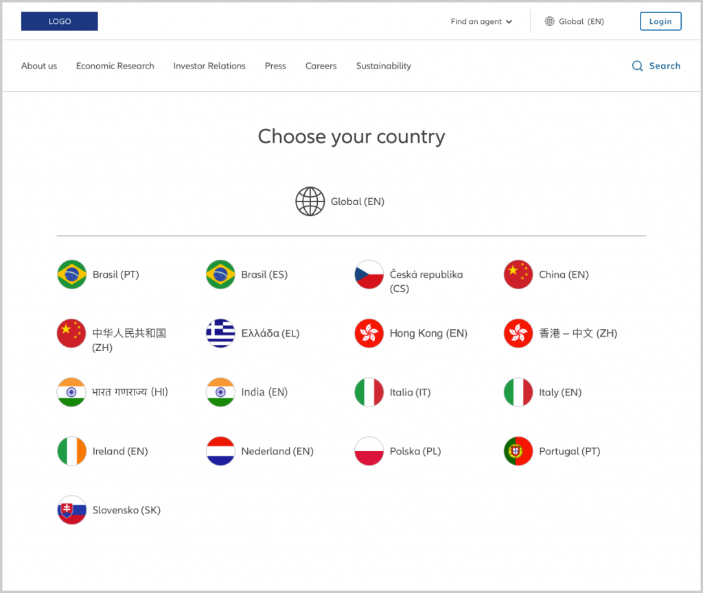
For text labelling the country’s name there’s a similar problem as with language selectors: For countries with more than one official language, we can never assume which language is understood by our visitors. A lot of country selectors that I found while researching the topic use English for country labels in general. This is a very anglocentric view – assuming everyone knows English, or at least knows how to spell one’s country’s name in English. In fact, people that don’t have basic English skills are likely to not find the country selector in this case.
To reach everyone of the audience, language and country labels need to use native language. If there’s more than one official language, we need more than one label.
This sums up the goals we laid out for an intuitive country/language selector for our demands:
- Use universally regocnizable icon/wording to trigger the language/country selector
- Show the the country/language that’s currently selected
- Show available country/language options in native language for everyone to easily recognize
- Guarantee quick scannability of selectable options
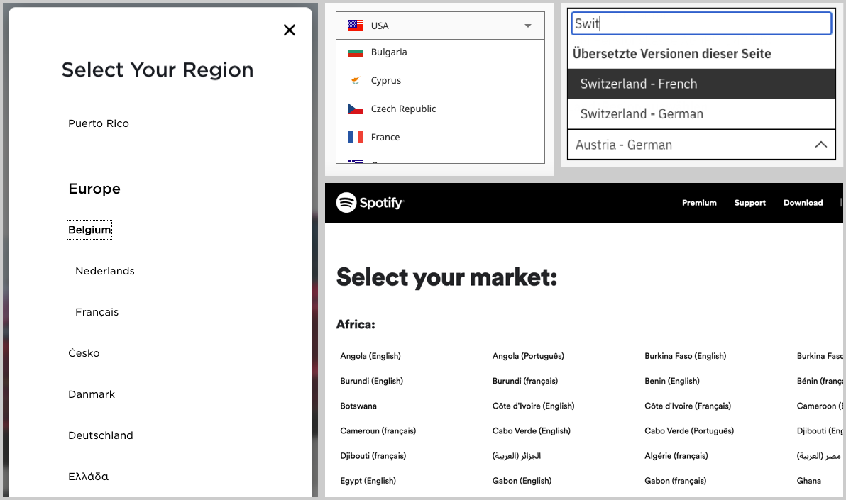
A landing page for selecting one’s region and language
Since our country selector project was about integrating that feature into an existing development and design framework, we had to deal with some constraints. After all, we were building a feature for a big design system used by various entities globally. The website’s header already offered the possibility to include a classic language selection, so we decided to use this section for the new feature as well.

In our case, the main entry point for the organization’s website variants was the global online presence. For this global version of the site, we used a globe icon to symbolize internationalization and country/language selection.
Our first ideas revolved around creating a seperate landing page for selecting one’s region and language. This variant offers a couple of advantages:
- Reducing interaction design complexity in the header (only containing a link to the selection page)
- Lots of space on the page for including many countries and language links, also including multiple native links for countries with more than one language
- A dedicated page seems most suitable for a task that most visitors use only once or not at all (due to automatic geolocation detection)
Big, global companies like Apple, Spotify or Nike use this approach.
In the end, we decided against this approach because it didn’t seem appropriate for selecting from around 15 countries maximum. Also, some technical limitations with the existing platform we were building for, rendered this option impossible.
A custom country selector flyout in the header
Since we had to deal with a limited amount of available countries (about 15 countries maximum), we decided to enhance an already existing flyout pattern in the header. To reduce complexity and dependencies for our new country selector pattern, we decided to integrate both country selector and language selector in the same flyout menu.
To make the feature universally recognizable, we used a globe icon for the site’s default global state.
Each available country version is represented by a line in the flyout menu and symbolized by the country’s flag icon. Furthermore, the text link for each country is included in native language. For countries with more than one official language, we used a separate link for each, written in native language.
We included the language’s ISO 639-1 two-letter code next to the native language link to make it even more recognizable as a language option – and to solve edge cases in which two language names are identical (as with Brazilian – both “Brasil” in Portuguese and Spanish).

Selecting a country and language from the flyout closes the menu, reloads the page’s corresponding localized version and places the selected country icon and language in the header section.
This pattern also supports the seamless redirection on page-to-page level (instead of site-to-site level).
Including country icons means more complexity for development, but I strongly opted for it. When comparing the two variants below, it’s obvious that the version without country icons is much less “scannable” and harder to use than the one with icons.

On mobile devices, we applied the same concept of selecting a country and language.

Here, the header can be toggled by tapping on the hamburger icon. The language selector is collapsed by default, tapping it reveals a list with all available country/language options. Once a country and language is selected, the header is closed automatically and the page is loaded with the respective settings.
Automation is the answer, but not to every question
Of course, the most user friendly approach to selecting country and language preferences is to take this burden off your site visitors and localize automatically.
This can be done easily today – and is considered the best practice for the topic:
- Using geolocation IP detection to suggest a regional website version to the user (or automatically redirect but include the option to change it)
- Detect the user’s browser language setting to switch to the corresponding language (use English as a fallback)
So, why do we still offer country and language selectors, if everything can be done automatically?
Automation always is a best guess only. It’s not faultless and we can never tell for sure, what our users really want. Just think of users who sign in from abroad while on a business trip. Forwarding them to a regional variant of the site might not make sense in this case.
The same holds true for using the browser language settings as a basis for auto-selecting the site’s language. Most of the times, this might be very accurate. But when users sign in from another than their own device, they might end up seeing information in a foreign language.
While automating country and language detection is a very good solution for the majority of cases, we should always include ways to change the settings for our users manually.

When designing country and language selectors, I found the most important thing to make it legible and clearly recognizable for users – no matter what their language and background is.