The User Experience of updating credit card details
Every few years, I receive a new credit card. Usually, it’s the same card, just with updated expiration date and a new CVC code.
So it should be a rather easy task to update the credit card information and continue using it.
Action required: Getting notified vs. updating credit card details upfront
The rise of the subscription economy for digital services changed my credit card usage. I used to only pay with it for the occasional online order, but these days, I have set up my credit card as payment method for a fair amount of online services. Yes, call me old-fashioned, but the credit card is still my online payment method of choice.
I could have updated my online payment methods right away when I received my new credit card, but I did not. After all, the credit card arrived a good month before the old one’s expiration date. I put it in my purse and forgot about it.
So, my first encounter with the required action arrived via e-mail. My web hosting provider sent me an e-mail stating that the monthly credit card payment had failed.
From my perspective as a user, this notification arrived too late. Since the expiration date of my card is well known to all online services I pay for, why wouldn’t they let me know some time in advance that I need to update my payment method? Receiving an alert message about a failed payment is way more discomforting than a gentle reminder for the required card update.

I did not receive any upfront reminder from any service I use.
Actually, it becomes harder to remember all the places I used the credit card with. Checking my last few credit card balances, I was able to identify the sites and apps I needed to go to for updating credit card details.
I decided to document and share some of my experiences.
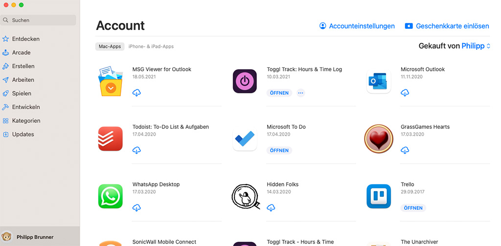
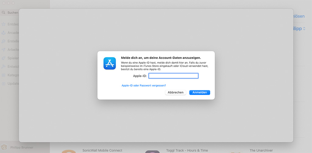
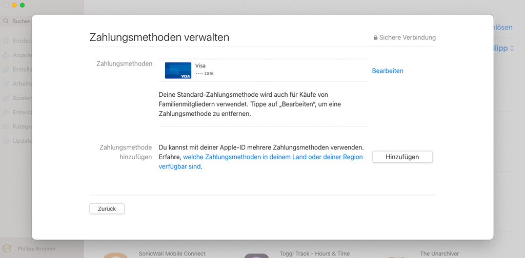
Apple App Store: A popup over a popup over …
Basically, Apple Store has a neat process for updating credit card details. But then, there’s the clunky interface that is the Apple Store MacOS app. Together with some design flaws, this makes the process mediocre, all things considered.
🏆 The good
- Well-structured account section with prominent listing of payment methods
- Dedicated user flow for updating credit card details
- Very quick process without repeated credit card verification via TAN
🚧 The not-so-good
- Account section is hard to find between operating system and web services
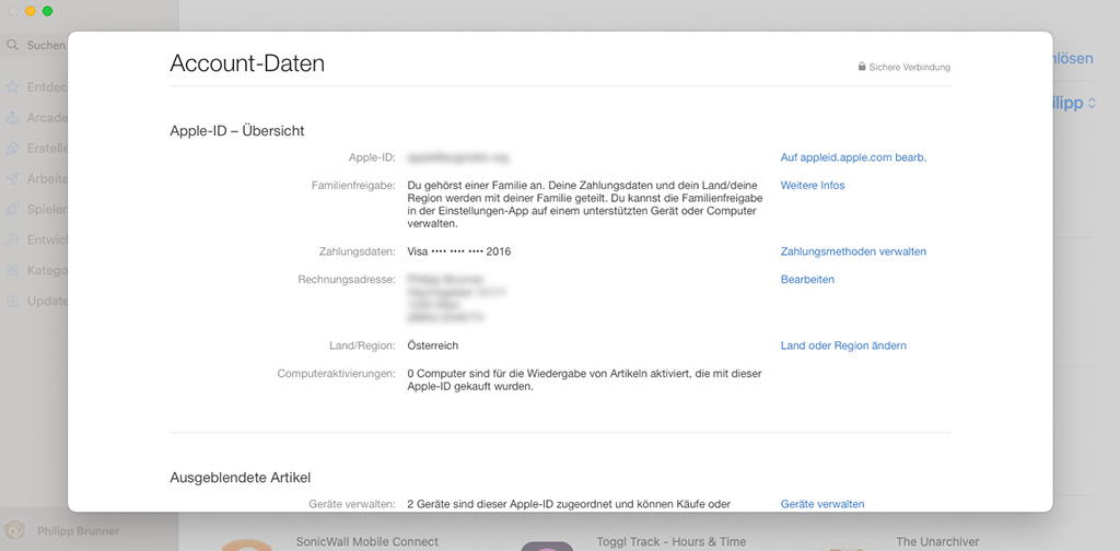
- Expiration date is not shown in payment overview which is inconvenient for this particular use case
🧨 The ugly
- Bad overall user experience switching between popups and windows
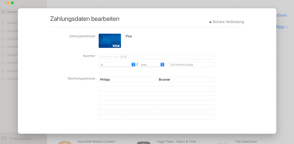
- Choosing expiration date from select fields is more effort than just typing it
I liked that Apple didn’t make me verify my card details again. They’ll probably verify with the next payment anyway. A clever trick to keep the effort low for the task at hand.
Netflix: security steals the show
Netflix’s account settings page and payment method flows feature a nice and clean design and don’t use popup/modal design patterns as most of the other services use. It feels very up to date and convenient, but then there’s “Verified by Visa”…
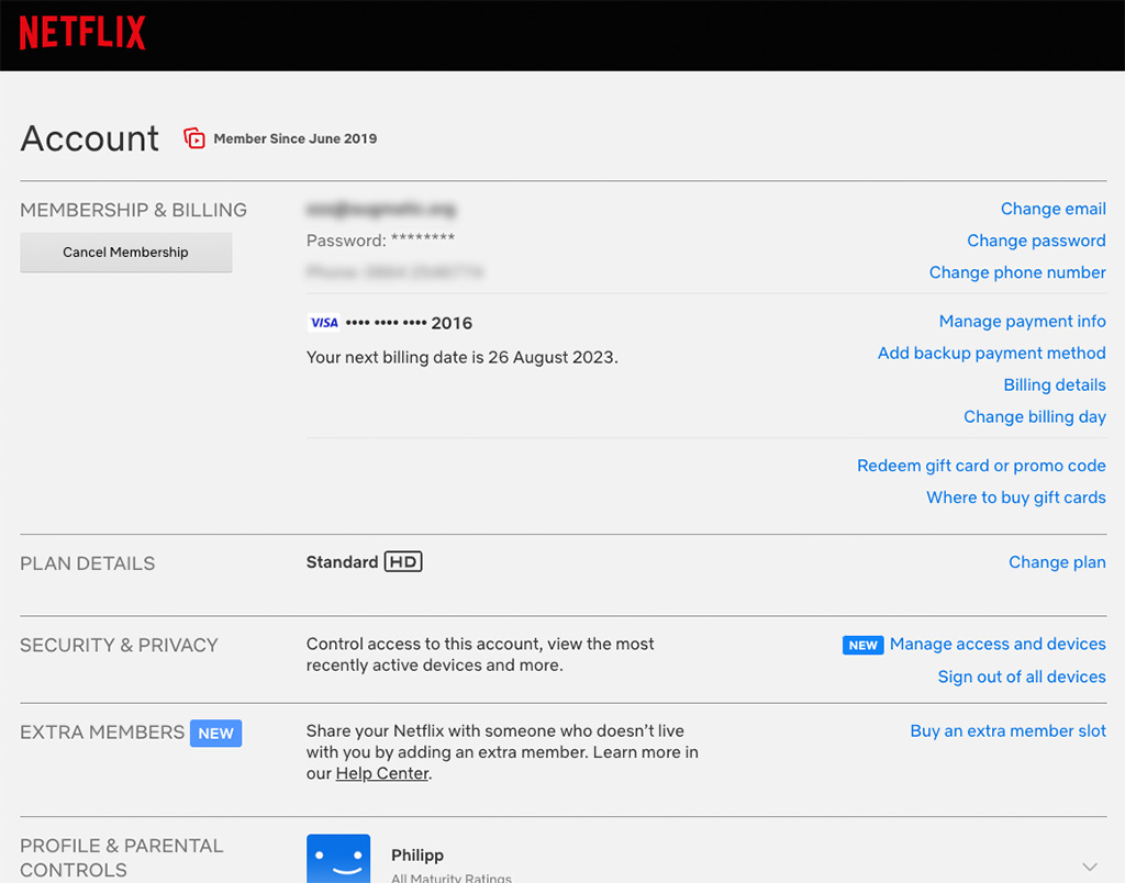
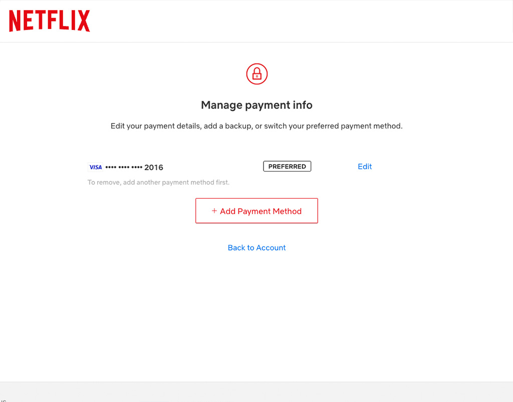


🏆 The good
- Account section and payment methods are easy to find
- Dedicated user flow for updating credit card details
- Expiration date can be entered by typing into a single field, automatically masking the input in the required format
🚧 The not-so-good
- Expiration date not shown in payment overview, but at least there’s a success notification after updating the card
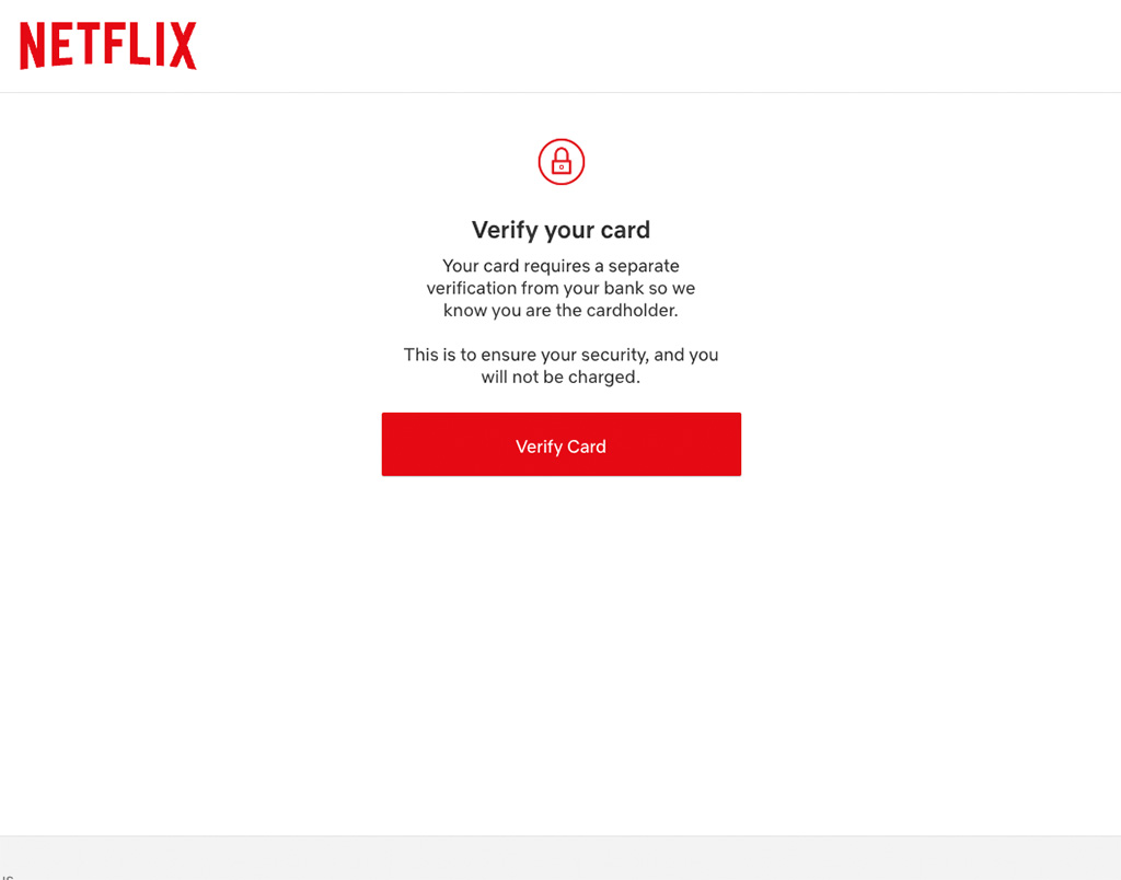
- Mandatory card verification needed directly after updating details
🧨 The ugly
- Very bad user experience of the external “Verified by Visa” verification: tiny text, small input fields, disrupted brand experience
It would be a perfect user flow, but the re-verification of the updated card ruins the experience. I wonder, why some services require this for security reasons, while others obviously don’t? Apart from the security perspective, “Verified by Visa” feels exceptionally bad – not only, but especially on mobile devices. Visa, do you need design help?
Spotify: the extra mile not taken
Spotify decided against offering a dedicated user flow for updating credit card details for a saved card. I can relate, sometimes there’s not enough time or budget to address certain edge cases. But for Spotify, really?
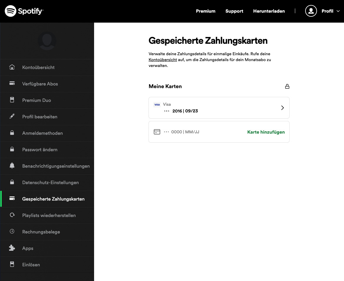

🏆 The good
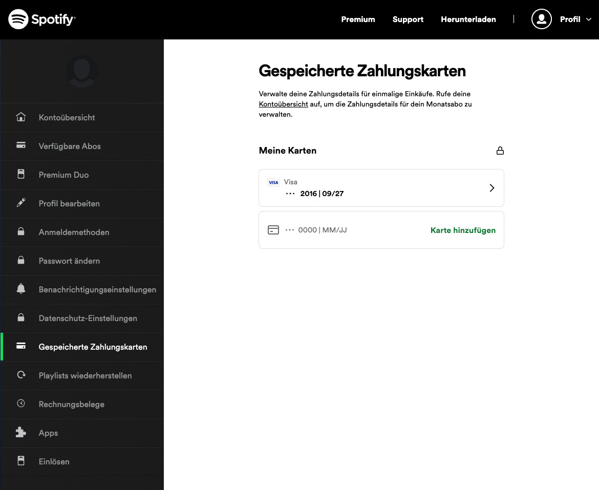
- Very clean account section, easy to find payments section (but it’s almost at the bottom of the menu)
- Payment method overview includes the expiration date – a handy reassurance before and after the update
- Expiration date can be entered by typing into a single field, automatically masking the input in the required format
- Very quick process without repeated credit card verification via TAN
🚧 The not-so-good
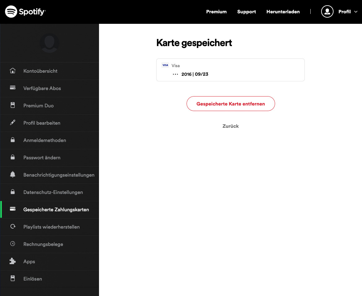
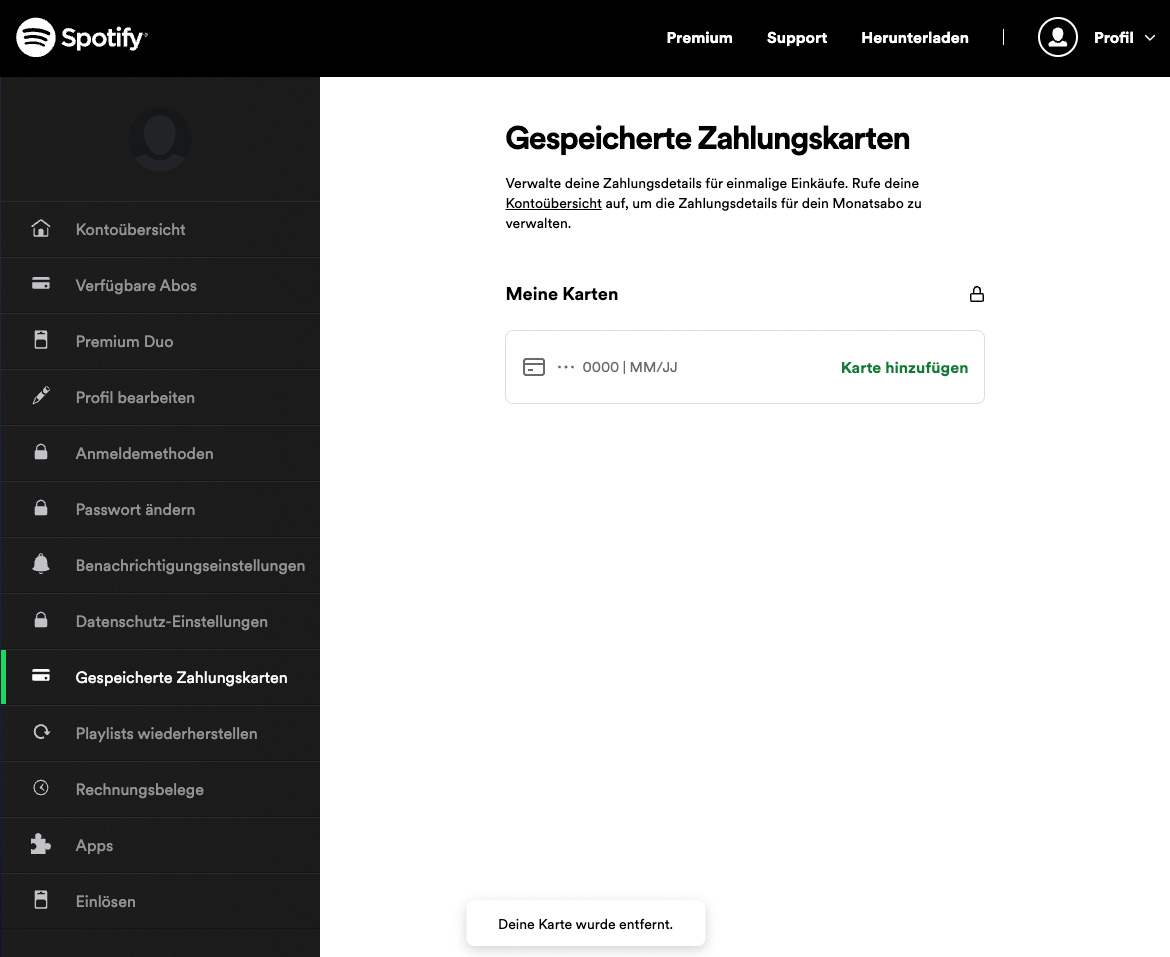
- No user flow for updating credit card details – to update the card, I need to add a new one
🧨 The ugly
- Like a trip through dead ends: I need to click on my saved card to find out, that I can only delete it. Then, I’m taken back to the payment overview empty state with an “add card” button, that looks like a saved credit card. I have to click again to finally add a new card.
As mentioned earlier, there are several possible reasons for not including “nice to have” user flows and features into iterations of a product. But in this case, I think Spotify could have put a little more love into an edge case that’s not so “edgy” for a lot of users, every few years.
Google Payments: A boring winner
Google has a very clean and efficient process in place for updating credit card details. The most difficult part is to actually find where to edit payment methods. This seems to be a common, immanent problem with the “big players”.


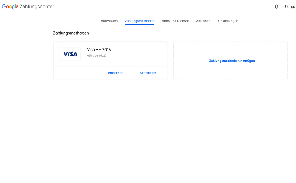
🏆 The good
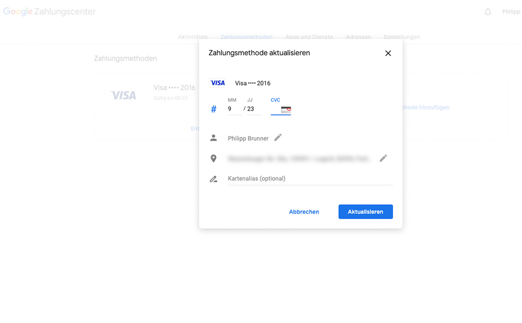
- Dedicated user flow for updating credit card details
- Payment method overview includes the expiration date – a handy reassurance before and after the update
- Expiration date can be entered by typing it into two seperate fields, each with input hints regarding the right format
- Very quick process without repeated credit card verification via TAN
🚧 The not-so-good
- Payments settings are hard to find – I had to google it
- Updating credit card details in a modal adds some inconvenience. This could be done inline in a separate page
Updating my credit card details with Google was easy and fun. The design is not very exciting but very effective and usable. An overall (almost) perfect experience. Maybe next time, Google could even remind me upfront for updating credit card details, offering the link to the Google Payments page, so I don’t have to google it?
A question of effort and experience
Design details make all the difference.
Not designing certain edge case scenarios might save some effort and costs in the first place. I’ve been there a couple of times. But still, user experience always profits from taking “the extra mile”.
An easy and quick way to update payment details is just a very small part of the overall user experience of these services. But when it needs to be done, a great service experience makes all the difference in the right moment.
Especially for big players like the ones featured in this article, any disruption from the perceived brand image could stay in their customer’s memory for longer…